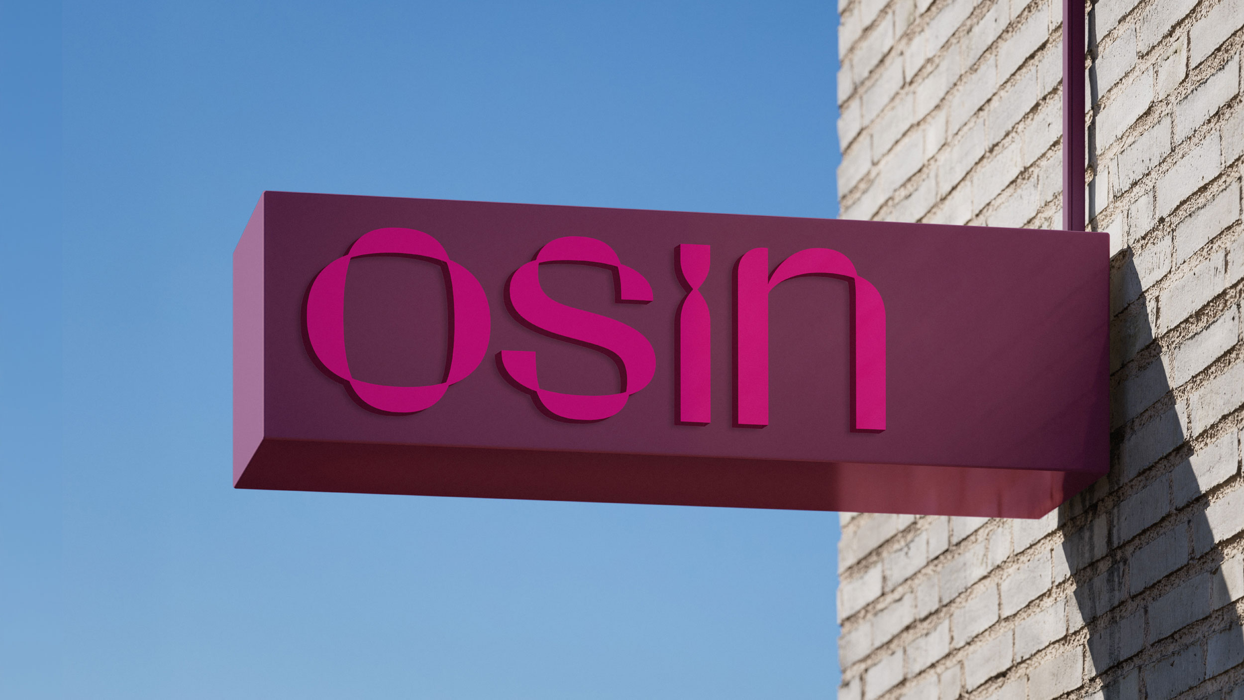
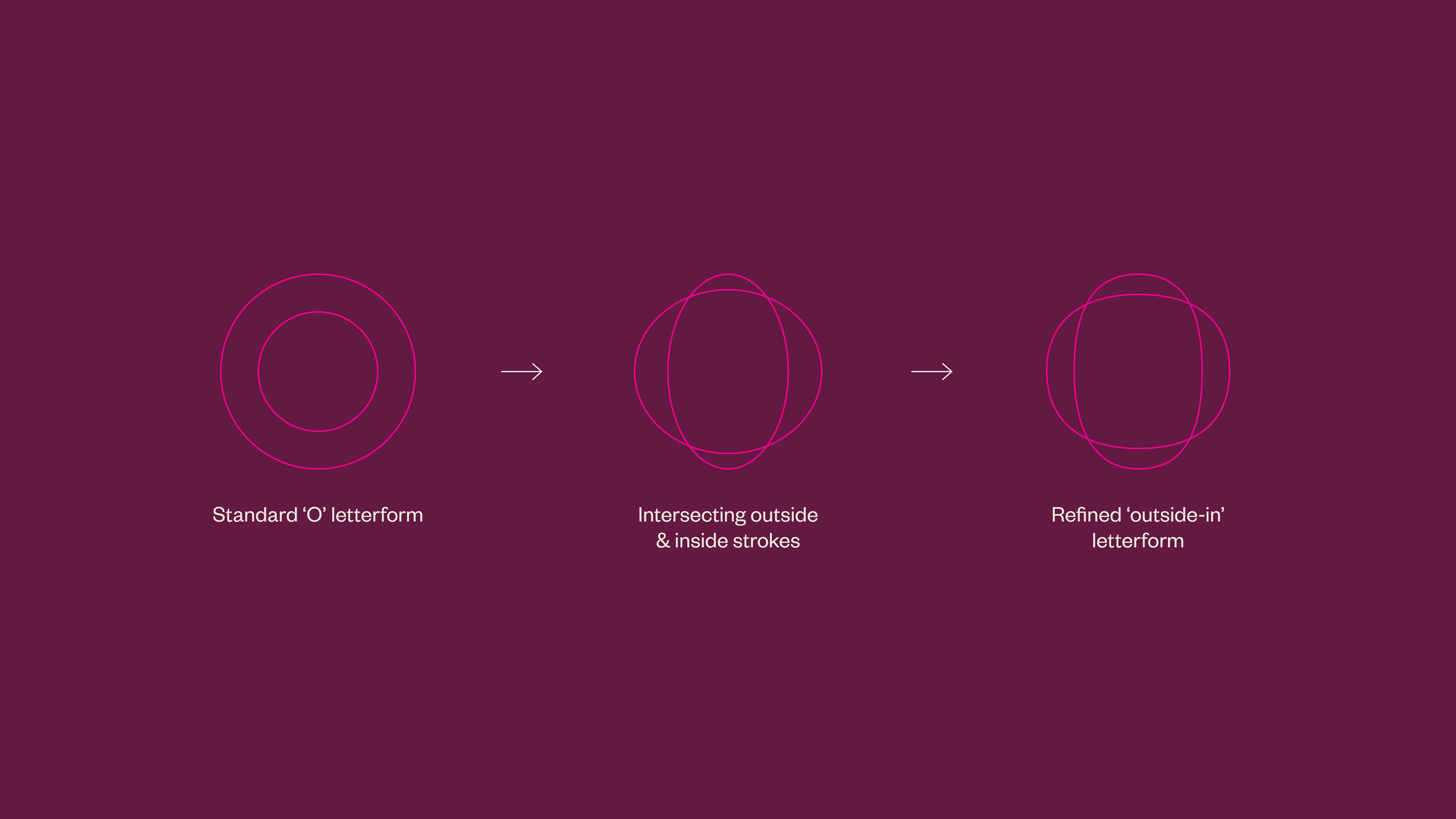
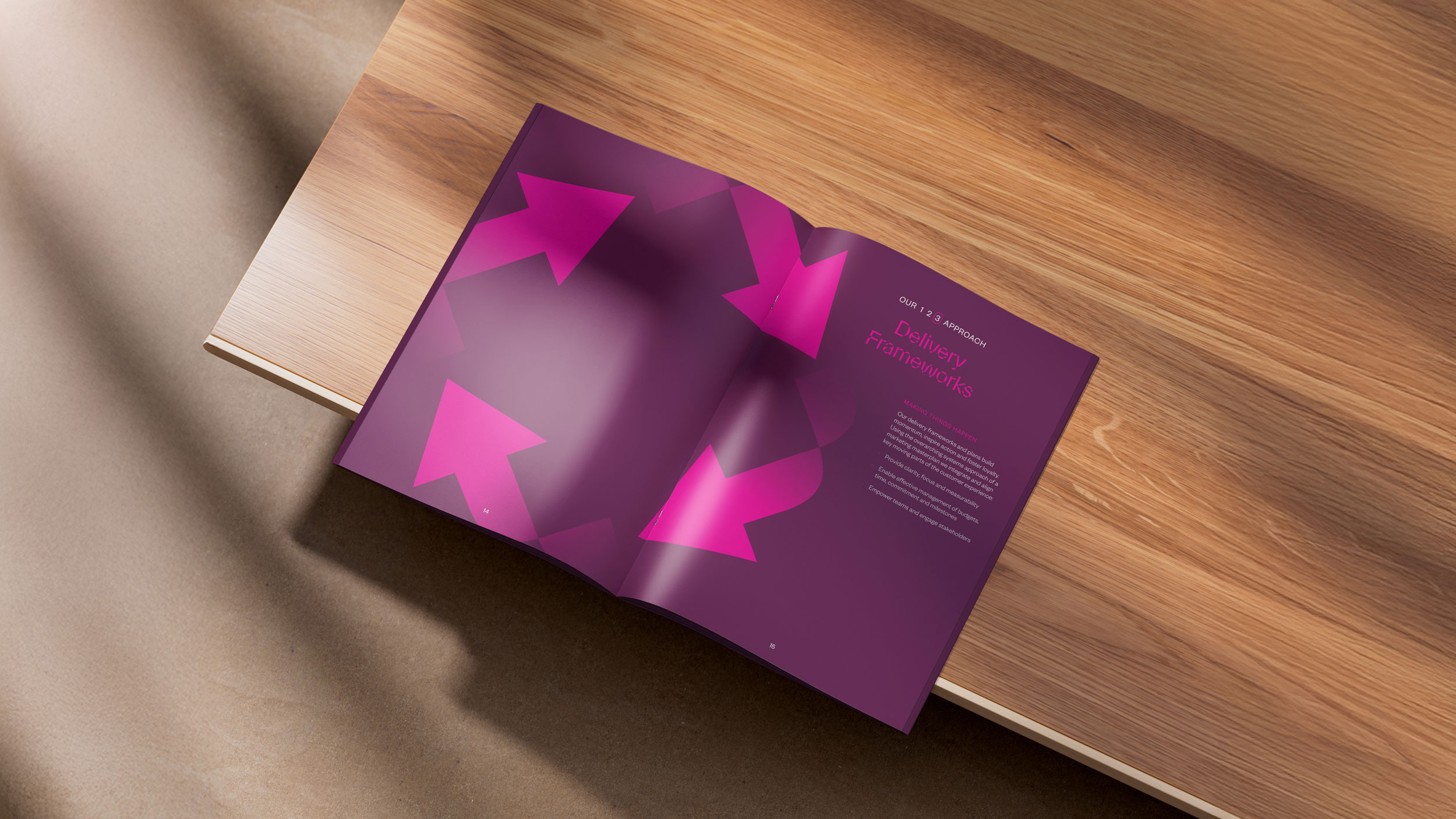
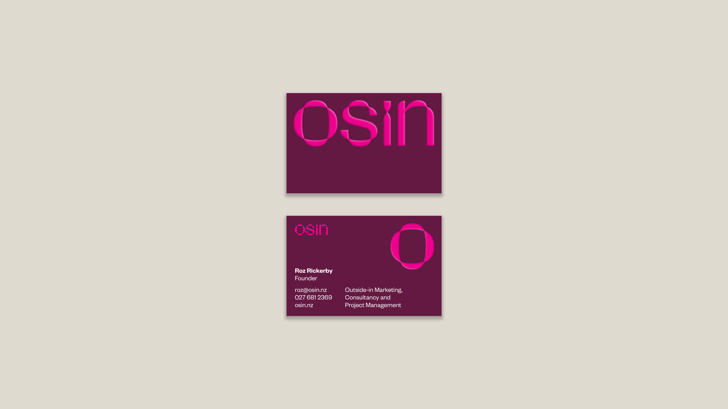
OSIN stands for Outside-In Marketing: an approach that gives brands a fresh perspective by looking at them from the outside. We built the identity around that shift in viewpoint, making the idea visible in both the typography and supporting graphics.
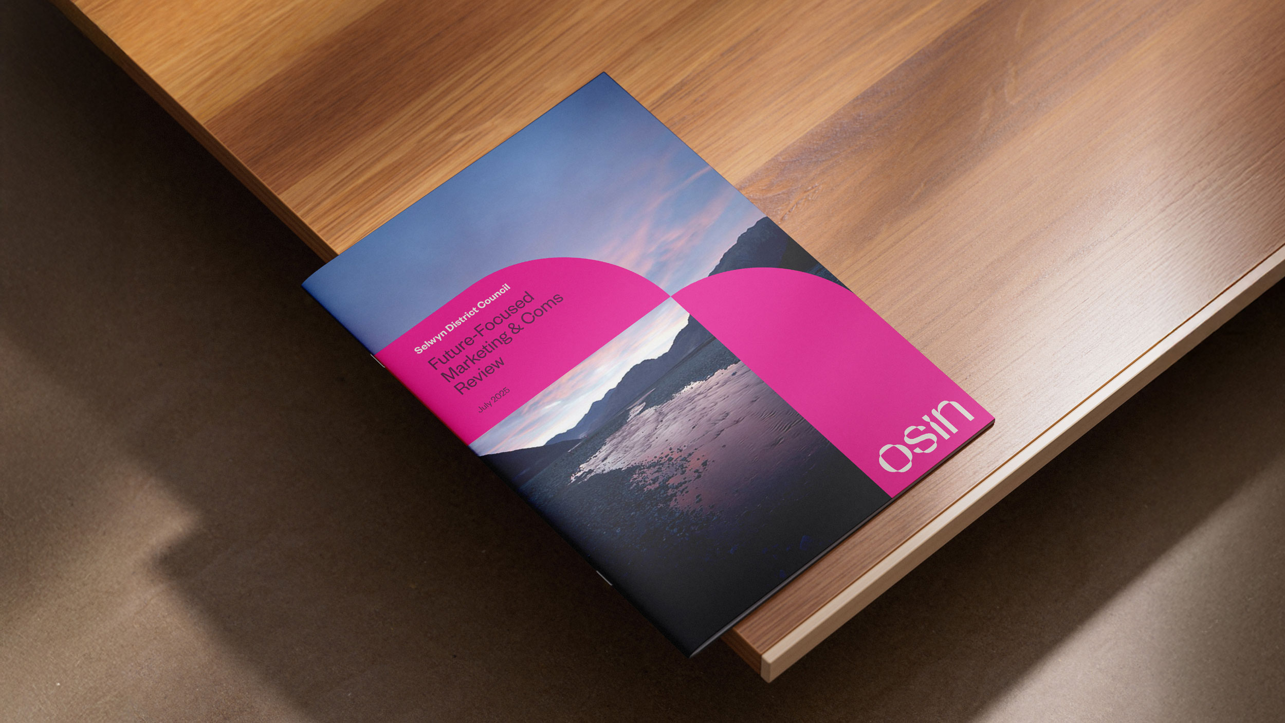
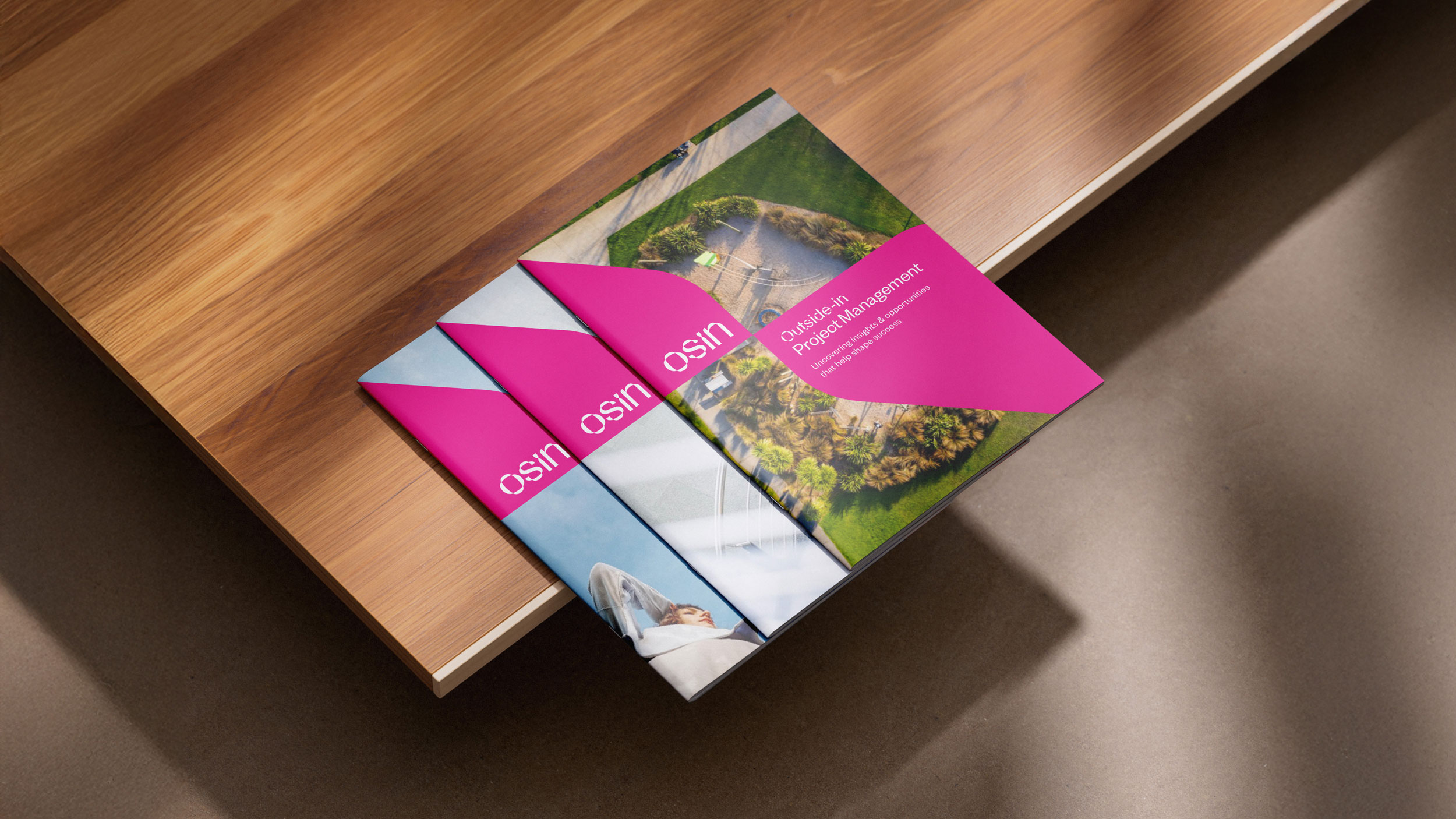
Parabole Display was a natural fit for the identity. Its letterforms flips the counters and stems, giving familiar shapes an unexpected inside-out quality. We carried that principle into bold blocks of colour that turn, overlap and weave through one another.
Together, the type and graphics give OSIN a distinctive visual language rooted in how it works: seeing what’s there from a different perspective.